
List of
Statistical Procedures
ANOVA
(Analysis of Variance):
Analysis of variance
(ANOVA) is a useful tool which helps the user to identify sources of
variability from one or more potential sources, sometimes referred to as
"treatments" or "factors".
One-Way
ANOVA
The one-way ANOVA is a
method of analysis that requires multiple experiments or readings to be
taken from a source that can take on two or more different inputs or
settings. The one-way ANOVA performs a comparison of the means of a
number of replications of experiments performed where a single input
factor is varied at different settings or levels. The object of this
comparison is to determine the proportion of the variability of the data
that is due to the different treatment levels or factors as opposed to
variability due to random error. The model deals with specific treatment
levels and is involved with testing the null hypothesis 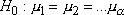 where
where
 represents
the level mean. Basically, rejection of the null hypothesis indicates
that variation in the output is due to variation between the treatment
levels and not due to random error. If the null hypothesis is rejected,
there is a difference in the output of the different levels at a significance
represents
the level mean. Basically, rejection of the null hypothesis indicates
that variation in the output is due to variation between the treatment
levels and not due to random error. If the null hypothesis is rejected,
there is a difference in the output of the different levels at a significance  and it remains to be determined between which
treatment levels the actual differences lie.
and it remains to be determined between which
treatment levels the actual differences lie.
Top
Box Plot:
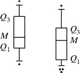
A
box-and-whisker plot (sometimes called simply a box plot) is a histogram-like
method of displaying data, invented by J. Tukey.
To create a box-and-whisker plot, draw a box with ends at the quartiles  and
and  .
Draw the statistical
median
.
Draw the statistical
median  as a horizontal
line in the box. Now extend the "whiskers" to the farthest points that
are not outliers (i.e., that are within 3/2 times the interquartile range of and ).
Then, for every point more than 3/2 times the interquartile range from the end of a box, draw a
dot. If two dots have the same value, draw them side by side.
as a horizontal
line in the box. Now extend the "whiskers" to the farthest points that
are not outliers (i.e., that are within 3/2 times the interquartile range of and ).
Then, for every point more than 3/2 times the interquartile range from the end of a box, draw a
dot. If two dots have the same value, draw them side by side.
Top
Correlation
Matrix:
If we have p parameters (variables) each
having n data points then the matrix obtained by computing Pearson's
Correlation Coefficient for all possible pairs is called the Correlation
matrix. This matrix must be symmetric (because correlation between X1
and X2 must be same as the correlation between X2 and X1) and all the
diagonal elements must be equal to one. The order of the matrix will be
pXp.
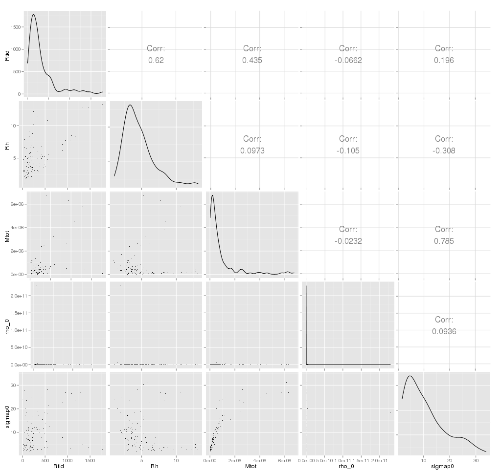
Matrix Plot: The combined scatter plot (XY plot) of
all the p parameters (variables) is called the matrix plot. An example
when p=5 and n=1000 is given below.
Top
Covariance:
Covariance
provides a measure of the strength of the correlation between two or
more sets of random variates. The covariance for two random variates  and
and  , each with sample
size
, each with sample
size  , is defined by
the
expectation value
, is defined by
the
expectation value
where
 and
and
 are
the respective means,
which can be written out explicitly as
are
the respective means,
which can be written out explicitly as
For
uncorrelated variates,
so
the covariance is zero. However, if the variables are correlated in some
way, then their covariance will be nonzero.
In fact, if  ,
then tends to increase
as increases, and if
,
then tends to increase
as increases, and if
 ,
then tends to decrease
as increases. Note
that while statistically independent variables are always uncorrelated,
the converse is not necessarily true.
,
then tends to decrease
as increases. Note
that while statistically independent variables are always uncorrelated,
the converse is not necessarily true.
Top
Empirical
Distribution Function:
In statistics,
an empirical distribution function is a cumulative
probability distribution function that concentrates probability 1/n
at each of the n numbers in a sample.
Let  be
random variables with realizations
be
random variables with realizations  .The
empirical distribution function Fn(x)
based on sample
.The
empirical distribution function Fn(x)
based on sample  is
a step
function defined by
is
a step
function defined by

where I(A) is an indicator
function
Top
Factor Analysis:
Factor Analysis is a dimensionality-reduction technique that aims to
find informative combinations of multivariate data using the rotation
techniques used in Principal Component Analysis (PCA). While the primary
aim to PCA is to find projections of the variables along the direction
of maximum variance, Factor Analysis aims to find latent factors that
influence the data.
As the solution of Factor Analysis cannot be obtained analytically, the
iterative solution depends on number of starting values of factors, the
maximum number of iterations permitted to reach the error minima and the
number of factors to be extracted from the data. The output consists of
loadings for the factors extracted and a hypothesis test tocheck if the
number of factors extracted is sufficient.
Top
Hierarchical Clustering:
Given a set of N variables (or objects if N is smalla) to be
clustered, and an NxN distance (or similarity) matrix, the basic process
of Johnson's (1967) hierarchical clustering is this:
- Start by assigning each variable to its own
cluster, so that if you have N variables, you now have N clusters, each
containing just one item. Let the distances (similarities) between the
clusters equal the distances (similarities) between the variables they
contain.
- Find the closest (most similar) pair of
clusters and merge them into a single cluster, so that now you have one
less cluster.
- Compute distances (similarities) between the
new cluster and each of the old clusters.
- Repeat steps 2 and 3 until all variables are
clustered into a single cluster of size N.
- By looking at the graphical presentation of
the distances computed at all the steps (called a dendrogram) and also
depending on the physical constraints decide the the step where one
should stop. That step will give the optimum number of clusters.
Step 3 can be done in different ways, which is what distinguishes
single-link from complete-link and average-link
clustering. In single-link clustering (also called the
connectedness or minimum method), we consider the distance
between one cluster and another cluster to be equal to the shortest
distance from any member of one cluster to any member of the other
cluster. If the data consist of similarities, we consider the similarity
between one cluster and another cluster to be equal to the greatest
similarity from any member of one cluster to any member of the other
cluster. In complete-link clustering (also called the diameter
or maximum method), we consider the distance between one
cluster and another cluster to be equal to the longest distance
from any member of one cluster to any member of the other cluster. In average-link
clustering, we consider the distance between one cluster and another
cluster to be equal to the average distance from any member of
one cluster to any member of the other cluster.
Top
Histogram:
In
statistics,
a histogram is a graphical
display of tabulated
frequencies. A histogram is the graphical version of a table which shows
what proportion
of cases fall into each of several or many specified categories.
The categories are usually specified as non overlapping intervals
of some variable. The categories (bars) must be adjacent
Top
Independent Component
Analysis:
Independent Component Analysis (ICA) is a dimensionality
reduction technique that aims to separate out different signals that
constitute a mixed source. A major point differentiating this technique
from other dimension reducing techniques is that it extracts
statistically independent, non-Gaussian signals. An efficient
implementation of this technique, known as FastICA, is used in the
analysis here details to which can be found in Help.
Top
K-Means
Clustering:
K-means (MacQueen,
1967) is one of the simplest unsupervised learning algorithms that solve
the well known clustering problem. The procedure follows a simple and
easy way to classify the objects of a given data set through a certain
number of clusters (assume k clusters) fixed a priori. The main idea is
to define k centroids, one for each cluster. These centroids should be
placed in a cunning way because of different location causes different
result. So, the better choice is to place them as much as possible far
away from each other. The next step is to take each point belonging to a
given data set and associate it to the nearest centroid. When no point
is pending, the first step is completed and an early groupage is done.
At this point we need to re-calculate k new centroids as barycenters of
the clusters resulting from the previous step. After we have these k new
centroids, a new binding has to be done between the same data set points
and the nearest new centroid. A loop has been generated. As a result of
this loop we may notice that the k centroids change their location step
by step until no more changes are done. In other words centroids do not
move any more.
Finally, this algorithm aims at minimizing an objective
function, in this case a squared error function. The objective function
 ,
,
where  is a chosen
distance measure between a data point
is a chosen
distance measure between a data point  and the cluster
centre
and the cluster
centre  , is an indicator
of the distance of the n data points from their respective
cluster centres. The algorithm is composed of the following steps:
, is an indicator
of the distance of the n data points from their respective
cluster centres. The algorithm is composed of the following steps:
- Place K points into the space
represented by the objects that are being clustered. These points
represent initial group centroids.
- Assign each object to the group
that has the closest centroid.
- When all objects have been
assigned, recalculate the positions of the K centroids.
- Repeat Steps 2 and 3 until the
centroids no longer move. This produces a separation of the objects
into groups from which the metric to be minimized can be calculated.
|
Although it can be proved that the procedure will always
terminate, the k-means algorithm does not necessarily find the most
optimal configuration, corresponding to the global objective function
minimum. The algorithm is also significantly sensitive to the initial
randomly selected cluster centres. The k-means algorithm can be run
multiple times to reduce this effect.
Top
Kernel Smoothing
Estimation of functions such as regression functions or
probability density functions. Kernel-based methods are most popular
non-parametric estimators. It can uncover structural features in the
data which a parametric approach might not reveal.
Univariate kernel density estimator:
Given a random sample X1; : : : ;Xn with a continuous, univariate
density f, the kernel density estimator is
f(x,h)
= (1/(nh)) ∑1n K ((x-Xi)/h)
with
kernel K and bandwidth
h. Under mild conditions (h must
decrease with increasing n) the kernel estimate converges in probability
to the true density.
The
Kernel K can be a proper pdf. Usually chosen to be unimodal and
symmetric
about zero. Center of kernel is placed right over each data point.
Influence of each data point is spread about its neighborhood.
Contribution from each point is summed to overall estimate.
The
band width h is a Scaling factor. It controls how wide the probability
mass is spread around a point. It also controls the smoothness or
roughness of a density estimate. Bandwidth selection bears danger of under- or oversmoothing.
Top
Kolmogorov
Smirnov one sample test:
The test for goodness of fit
usually involves examining a random sample from some unknown
distribution in order to test the null hypothesis that the unknown
distribution function is in fact a known, specified function. We usually
use Kolmogorov-Smirnov test to check the normality assumption in
Analysis of Variance. However it can be used for other continuous
distributions also. A random sample X1,X2, .
. . , Xn is drawn from some population and is compared with F*(x)
in some way to see if it is reasonable to say that F*(x)
is the true distribution function of the random sample.
One logical way of comparing the
random sample with F*(x) is by means of the empirical distribution function
S(x). Let X1,X2,
. . . , Xn be a random sample. The empirical distribution function S(x) is a function of x, which equals
the fraction of Xis that are less than or equal to x for each x
The empirical distribution function S(x) is useful as an
estimator of F(x), the unknown distribution function of
the Xis.
We
can compare the empirical distribution function S(x) with
hypothesized distribution function F*(x) to see if there
is good agreement. One of the simplest measures is the
largest distance between the two functions S(x) and F*(x),
measured in a vertical direction. This is the statistic suggested by
Kolmogorov (1933).
Let the test statistic T be the greatest (denoted by "sup" for
supremum) vertical distance between S(x) and F(x).In
symbols we say
T = sup x | F*(x)
- S(x) |
For testing H0 : F(x) = F*(x)
for all x
H1 : F(x) ¹ F*(x) for
at least one value of x
If
T exceeds the 1-á quantile as given by Table then we reject H0
at the level of significance á. The approximate p-value
can be found by interpolation in Table.
Emample:
A
random sample of size 10 is obtained: X1 = 0.621,X2 = 0.503,X3 =
0.203,X4 = 0.477,X5 = 0.710,X6 = 0.581,X7 = 0.329,X8 = 0.480,X9 =
0.554,X10 = 0.382.The null hypothesis is that the distribution function
is
the uniform distribution function .The mathematical expression for the
hypothesized distribution function is
F*(x) = 0, if x < 0
x, if 0 ≤ x < 1
1, if 1≤ x
Formally , the hypotheses are given by
H0
: F(x) = F∗(x) for all x from −∞ to
∞
H1
: F(x) /= F∗(x) for at least one value of x
where F(x) is the unknown distribution function Common to the Xis
and
F∗(x) is given by above equation.
The Kolmogorov test for goodness of fit is used. The critical region of
size α = 0.05 corresponds to values of T greater
than the 0.95 quantile 0.409, obtained from Table for n=10. The value of
T is obtained by graphing the empirical distribution function S(x)
on the top of the hypothesized distribution function F*(x).The largest vertical
distance is 0.290, which occurs at x = 0.710 because S(0.710)
= 1.000 and F*(0.710)=0.710.In
other words,
T = sup x | F*(x) − S(x)
|
=
| F*(0.710) − S(0.710)
| = 0.290
Since T=0.290 is less than 0.409, the null hypothesis is accepted. In
other words, the unknown distribution F(x) can be considered to be of
the form F*(X) on the basis of the given sample. The p value is
seen, from Table, to be larger than 0.20.
Top
Kolmogorov Smirnov two sample test:
Perform a Kolmogorov-Smirnov two sample test
that two data samples come from the same distribution. Note that we are
not specifying what that Common distribution is.
The two sample K-S test is a variation of one
sample test. However, instead of comparing an empirical distribution
function to a theoretical distribution function, we compare the two
empirical distribution functions. That is,
D=sup x | S1(x) − S2(x)|
where S1 and S2 are the empirical
distribution functions for the two samples. Note that we compute S1
and S2 at each point in both samples (that is both S1
and S2 are computed at each point in each sample).
The hypothesis regarding the distributional form is rejected if
the test statistic, D, is greater than the critical value obtained from
a table. There are several variations of these tables in the literature
that use somewhat different scaling for the K-S test statistic and
critical regions. These alternative formulations should be equivalent,
but it is necessary to ensure that the test statistic is calculated in a
way that is consistent with how the critical values were tabulated.
Top
Kruskal Wallis two sample
test:
The Kruskal-Wallis test is a nonparametric test used to compare
three or more samples. It is used to test the null hypothesis that all
populations have identical distribution functions against the
alternative hypothesis that at least two of the samples differ only with
respect to location (median), if at all.
It is the analogue to the F-test used in analysis
of variance. While analysis of variance tests depend on the assumption
that all populations under comparison are normally distributed, the
Kruskal-Wallis test places no such restriction on the comparison.
The Kruskal-Wallis test statistic for k
samples, each of size ni is:
- where N is the total number (all ni) and
Ri is the sum of the ranks (from all samples pooled) for the ith sample
and:
The null hypothesis of the test is that
all k distribution functions are equal. The alternative hypothesis is
that at least one of the populations tends to yield larger values than
at least one of the other populations.
Assumptions:
- random samples from populations
- independence within each sample
- mutual independence among samples
- measurement scale is at least ordinal
- either k population distribution functions are identical, or else some of the populations tend to yield larger values than other populations
The
test statistic for the Kruskal-Wallis test is T. This value is compared
to a table of critical values based on the sample size of each group. If
T exceeds the critical value at some significance level (usually
0.05) it means that there is evidence to reject the null hypothesis in
favor of the alternative hypothesis.
Top
Mean and Standard deviation:
Mean: The arithmetic mean of a set of values is
the quantity Commonly called "the" mean or the average. Given a set of
samples  ,
(i=1,2,...N) the arithmetic mean is
,
(i=1,2,...N) the arithmetic mean is
When
viewed as an estimator for the mean of the underlying distribution
(known as the population
mean), the arithmetic mean of a sample is
called the sample
mean.
For
a continuous
distribution function, the arithmetic mean of the population, denoted  ,
and called the population
mean of the distribution, is given by
,
and called the population
mean of the distribution, is given by
Similarly,
for a discrete
distribution,
The
sample mean  is
an estimate of the population mean μ.
is
an estimate of the population mean μ.
Standard
deviation:
In
probability and statistics,
the standard deviation is a measure of the mean distance of
values in a data set from their mean. For
example, in the data set (2, 4), the mean is 3 and the standard
deviation is 1. Standard deviation is the most Common measure of
statistical dispersion, measuring how spread out the values are in a
data set. If the data points are all close to the mean, then the
standard deviation is low (closer to zero). If many data points are very
different from the mean, then the standard deviation is high (further
from zero). If all the data values are equal, then the standard
deviation will be zero. The standard deviation has no maximum value
although it is limited for most data set.
The standard deviation is defined as the square
root of the variance.
This means it is the root mean
square (RMS) deviation from the arithmetic
mean. The standard deviation is always a positive number (or zero) and
is always measured in the same units as the original data. For example,
if the data are distance measurements in meters, the standard deviation
will also be measured in meters
The sample standard deviation is given by
And the population standard deviation is given by

where E(X) is the expected
value of X.
Median:
The
median is the middle of a distribution: half the scores are above the
median and half are below the median. The median is less sensitive to
extreme scores than the mean and
this makes it a better measure than the mean for highly skewed
distributions. The median income is usually more informative than the
mean income, for example.
When there is an odd number of numbers, the median is simply the
middle number. For example, the median of 2, 4, and 7 is 4.
When there is an even number of numbers, the median is the mean
of the two middle numbers. Thus, the median of the numbers 2, 4, 7, 12
is (4+7)/2 = 5.5.
Top
One and two sample t-tests:
One Sample( test for one mean value):
Let X1,X2,...Xn be
a random sample drawn from a Normal population with mean µ and sd
σ. Student's t test is used to compare the unknown mean of the
population (µ) to a known number (µ0). So here the Null
hypothesis is Ho: µ =µ0
against the alternative H1: µ is not equal to µ0.
Test statistic (population standard
deviation σ is known):
The formula for the Z-test is
Z = √n(Sample mean-
µ0) / σ
Z has a Normal distribution with mean 0 and
variance 1.
Test statistic (population standard
σ deviation is unknown):
The formula for t test is t = √n(Sample mean-
µ0) / s
Where s is the sample standard devation.
The statistic t follows t
distribution with n-1 degrees of freedom, where n is the number of
observations.
Decision of the z or t-test: If
the p-value associated with the z or t-test is small (usually set at p
< 0.05), there is evidence to reject the null hypothesis in favor of
the alternative. In other words, there is evidence that the mean is
significantly different than the hypothesized value i.e. the test
is significant. If the p-value associated with the z or t-test is not
small (p > 0.05), there is not enough evidence to reject the null
hypothesis, and you conclude that there is evidence that the mean is not
different from the hypothesized value i.e. the test is not
significant.
Two sample ( test for equality
of two means )
Suppose we have two
independent samples The unpaired t method tests the null hypothesis that
the population means related to two independent, random samples from two
independent approximately normal distributions are equal against the
alternative that they are unequal (as in the one sample case).
Assuming equal variances, the
test statistic is calculated as:
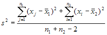
where
x bar 1 and x bar 2 are the sample means, s² is the pooled sample
variance, n1 and n2 are the sample sizes and t follows Student t
distribution with n1 + n2 - 2 degrees of freedom.
Paired Sample (from
Bivariate Normal Distribution):
The
paired t test provides a hypothesis test of the difference between
population means for a pair of random samples whose differences are
approximately normally distributed.
The
test statistic is calculated as:

where
d bar is the mean difference, s² is the sample variance, n is the
sample size and t follows a paired t distribution with n-1 degrees
of freedom.
The
decision can be taken exactly in a similar way as in the one sample
situation.
Top
Optimum 'k' for
k-Means:
k-Means clustering is an exploratory tool that helps to discover
features in a dataset. Optimum 'k' for k-Means is a tool to help
determine the optimum number of clusters that can be extracted from
data. This tool works by performing k-Means clustering on the dataset
for varying number of clusters (default from 1 to 10) and chooses the
optimum number based on the distance between points in a cluster.
Inferring directly from this distance can sometimes lead to ambiguity
which is why it is transformed using a Distortion Factor. Multiple
values of Distortion can (and should) be entered by separating them with
a comma.
The output for the test displays the optimum number of clusters both
textually and graphically.
Top
Pair Plots:
Scatter plots of the
values being compared are generated for each pair of coefficients in x. Different
symbols (colors) are used for each object being compared and values
corresponding to the same group are joined by a line, to facilitate
comparison of fits. If only two coefficients are present then it is
equivalent to xyplot.
Top
Pearson, Kendall and Spearman correlation:
Correlation is a statistical technique which can show whether and
how strongly pairs of variables are related. For example, height and
weight are related - taller people tend to be heavier than shorter
people. The relationship isn't perfect. People of the same height vary
in weight, and you can easily think of two people you know where the
shorter one is heavier than the taller one. Nonetheless, the average
weight of people 5'5'' is less than the average weight of people 5'6'',
and their average weight is less than that of people 5'7'', etc.
Correlation can tell you just how much of the variation in peoples'
weights is related to their heights.
Although this correlation is fairly obvious your data may contain
unsuspected correlations. You may also suspect there are correlations,
but don't know which are the strongest. An intelligent correlation
analysis can lead to a greater understanding of your data..
Like all statistical techniques, correlation is only appropriate
for certain kinds of data. Correlation works for data in which numbers
are meaningful, usually quantities of some sort. It cannot be used for
purely categorical data, such as gender, brands purchased or favorite
color.
The correlation
coefficient r (also called Pearson's product moment correlation after Karl
Pearson) is calculated by
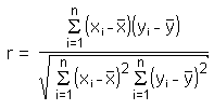
The main result of a correlation is called the correlation
coefficient (or "r"). It ranges from -1.0 to +1.0. The closer r is to
+1 or -1, the more closely the two variables are related.
If r is close to 0, it means there is no relationship between the
variables. If r is positive, it means that as one variable gets larger
the other gets larger. If r is negative it means that as one gets
larger, the other gets smaller (often called an "inverse" correlation).
While correlation coefficients are normally reported as r = (a
value between -1 and +1), squaring them makes then easier to understand.
The square of the coefficient (or r square) is equal to the percent of
the variation in one variable that is related to the variation in the
other. After squaring r, ignore the decimal point. An r of .5 means 25%
of the variation is related (.5 squared =.25). An r value of .7 means
49% of the variance is related (.7 squared = .49).
A key thing to remember when working with correlations is never
to assume a correlation means that a change in one variable causes
a change in another. Sales of personal computers and athletic shoes have
both risen strongly in the last several years and there is a high
correlation between them, but you cannot assume that buying computers
causes people to buy athletic shoes (or vice versa). These are called
spurious correlations.
The second caveat is that the Pearson correlation technique works
best with linear relationships: as one variable gets larger, the other
gets larger (or smaller) in direct proportion. It does not work well
with curvilinear relationships (in which the relationship does not
follow a straight line). An example of a curvilinear relationship is age
and health care. They are related, but the relationship doesn't follow a
straight line. Young children and older people both tend to use much
more health care than teenagers or young adults. Multiple regression
(also included in the Vostat Module) can be used to examine curvilinear
relationships.
Geometric Interpretation of
correlation
The correlation coefficient can also be viewed as the
cosine of the angle between the two vectors of
samples drawn from the two random variables.
Caution: This method only works with centered data,
i.e., data which have been shifted by the sample mean so as to have an
average of zero. Some practitioners prefer an uncentered
(non-Pearson-compliant) correlation coefficient. See the example below
for a comparison.
As an example, suppose five countries are found to
have gross national products of 1, 2, 3, 5, and 8 billion dollars,
respectively. Suppose these same five countries (in the same order) are
found to have 11%, 12%, 13%, 15%, and 18% poverty. Then let x and
y be ordered 5-element vectors containing the above data: x
= (1, 2, 3, 5, 8) and y = (0.11, 0.12, 0.13, 0.15, 0.18).
By the usual procedure for finding the angle between
two vectors (see dot
product), the uncentered correlation coefficient is:
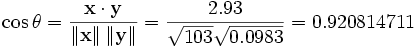
Note that the above data were deliberately chosen to
be perfectly correlated: y = 0.10 + 0.01 x. The Pearson
correlation coefficient must therefore be exactly one. Centering the
data (shifting x by E(x) = 3.8 and y by E(y)
= 0.138) yields x = (-2.8, -1.8, -0.8, 1.2, 4.2) and y =
(-0.028, -0.018, -0.008, 0.012, 0.042), from which
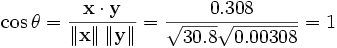
as expected.
Top
Principal
Component Analysis:
Principal Component Analysis (PCA) involves a mathematical
procedure that transforms a number of (possibly) correlated variables
into a (smaller) number of uncorrelated variables called principal
components. The first principal component accounts for as much of the
variability in the data as possible, and each succeeding component
accounts for as much of the remaining variability as possible. Each
principal component is a linear combinations of all the variables with
different coefficients.
Objectives
of principal component analysis
- To discover or to reduce the
dimensionality of the data set.
- To identify new meaningful underlying
variables.
Top
Probability
Plot:
Normal Test
Plots (also called Normal Probability Plots or Normal Quartile Plots)
are used to investigate whether process data exhibit the standard normal
"bell curve" or Gaussian distribution.
First, the
x-axis is transformed so that a cumulative normal density function will
plot in a straight line. Then, using the mean and standard deviation
(sigma) which are calculated from the data, the data is transformed to
the standard normal values, i.e. where the mean is zero and the standard
deviation is one. Then the data points are plotted along the fitted
normal line.
The nice
thing is that you don't have to understand all the transformations. All
you have to do is look at the plotted points, and see how well they fit
the normal line. If they fit well, you can safely assume that your
process data is normally distributed.
p-value:
Each
statistical test has an associated null hypothesis, the p-value is the
probability that your sample could have been drawn from the
population(s) being tested (or that a more improbable sample could be
drawn) given the assumption that the null hypothesis is true. A p-value
of .05, for example, indicates that you would have only a 5% chance of
drawing the sample being tested if the null hypothesis was actually
true.
Null Hypotheses are typically statements of no difference or effect. A
p-value close to zero signals that your null hypothesis is false, and
typically that a difference is very likely to exist. Large p-values
closer to 1 imply that there is no detectable difference for the sample
size used. A p-value of 0.05 is a typical threshold .
Top
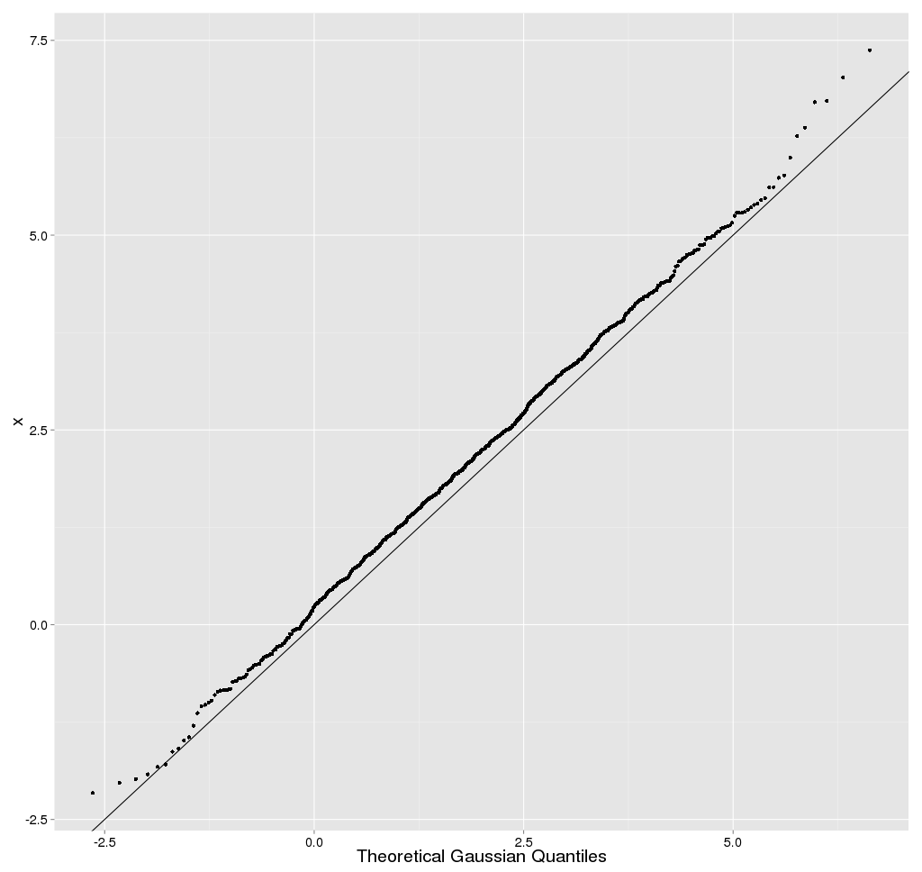
Quantile-Quantile Plot
(The quantile-quantile (q-q) plot is a
graphical technique for determining if two data sets come from
populations with a Common distribution.
A q-q plot is a plot of the quantiles of the
first data set against the quantiles of the second data set. By a
quantile, we mean the fraction (or percent) of points below the given
value. That is, the 0.3 (or 30%) quantile is the point at which 30%
percent of the data fall below and 70% fall above that value.
A 45-degree reference line is also plotted. If the two sets come
from a population with the same distribution, the points should fall
approximately along this reference line. The greater the departure from
this reference line, the greater the evidence for the conclusion that
the two data sets have come from populations with different
distributions. )
Top
Sample
Generation:
Sample generation is a AstroStat tool that generates random samples of a
given size from the specified distribution. These samples are available
as CSV files for further use in the application. In addition, to check
the distribution of the generated samples, histograms of each are
plotted.
To execute this test, input the number of samples and the size of each
along with the distribution from which they are to be derived.
Top
Shapiro-Wilks
test:
Shapiro-Wilks test is a formal test of normality offered .
This is the standard test for normality. W may be thought of as the
correlation between given data and their corresponding normal scores,
with W = 1 when the given data are perfectly normal in distribution.
When W is significantly smaller than 1, the assumption of normality is
not met. That is, a significant W statistic causes the researcher to
reject the assumption that the distribution is normal. Shapiro-Wilks W
is recommended for small and medium samples up to n = 2000. For larger
samples, the Kolmogorov-Smirnov test is recommended.
The Wilks Shapiro test statistic is defined as:
![W = {SUM(w(i)X'(i)}**2/[SUM(X(i)-XBAR)**2]](astrostat_help_files/image050.gif)
where the summation is from 1 to n and n is the number of
observations. The array X contains the original data, X' are the ordered
data,  is
the sample mean of the data, and w'=(w1, w2, ... , wn) or
is
the sample mean of the data, and w'=(w1, w2, ... , wn) or
![w'=M'V**(-1)[(N'V**(-1))(V**(-1)M)]**(-1/2)](astrostat_help_files/image052.gif)
M denotes the expected values of standard normal order statistics
for a sample of size n and V is the corresponding covariance matrix.
W may be thought of as the squared correlation coefficient
between the ordered sample values (X') and the wi. The wi
are approximately proportional to the normal scores Mi. W is
a measure of the straightness of the normal probability plot, and small
values indicate departures from normality.
Top
Linear Regression:
In statistics,
linear regression is a method of estimating the conditional expected
value of one variable y given the values of some other variable
or variables x. The variable of interest, y, is
conventionally called the "response
variable". The terms "endogenous variable" and "output variable" are
also used. The other variables x are called the
explanatory variables. The terms "exogenous variables" and "input
variables" are also used, along with "predictor variables". The term
independent variables is sometimes used, but should be avoided as the
variables are not necessarily
statistically independent. The explanatory and response variables may be
scalars or
vectors.
Multiple
regression includes cases with more than one explanatory variable.
The term explanatory variable suggests that its
value can be chosen at will, and the response variable is an
effect, i.e., causally dependent on the explanatory variable, as in a
stimulus-response model. Although many linear regression models are
formulated as models of cause and effect, the direction of causation may
just as well go the other way, or indeed there need not be any causal
relation at all. For that reason, one may prefer the terms "predictor /
response" or "endogenous / exogenous," which do not imply causality.
Regression, in general, is the
problem of estimating a conditional expected value.
It is often erroneously thought that the reason the
technique is called "linear regression" is that the graph of y = α + βx is a line.
But in fact, if the model is
(in which case we have put the vector  in
the role formerly played by xi
and the vector (β,γ) in the role
formerly played by β), then the
problem is still one of linear regression, even though the graph
is not a straight line.
in
the role formerly played by xi
and the vector (β,γ) in the role
formerly played by β), then the
problem is still one of linear regression, even though the graph
is not a straight line.
Linear regression is called "linear" because the
relation of the response to the explanatory variables is assumed to be a
linear
function of some parameters. Regression models which are not a linear
function of the parameters are called nonlinear
regression models. A neural
network is an example of a nonlinear regression model.
Top
Survival:
These techniques were
primarily developed in the medical and biological sciences, but they are
also widely used in the social and economic sciences, as well as in
engineering (reliability and failure time analysis).
To study the
effectiveness of a new treatment for a generally terminal disease the
major variable of interest is the number of days that the respective
patients survive. In principle, one could use the standard parametric
and nonparametric statistics for describing the average survival, and
for comparing the new treatment with traditional methods. However, at
the end of the study there will be patients who survived over the entire
study period, in particular among those patients who entered the
hospital (and the research project) late in the study; there will be
other patients with whom we will have lost contact. Surely, one would
not want to exclude all of those patients from the study by declaring
them to be missing data (since most of them are "survivors" and,
therefore, they reflect on the success of the new treatment method).
Those observations, which contain only partial information are called
censored observations.
Censored Observations:
In general, censored
observations arise whenever the dependent variable of interest
represents the time to a terminal event, and the duration of the study
is limited in time. Censored observations may occur in a number of
different areas of research. For example, in the social sciences we may
study the "survival" of marriages, high school drop-out rates (time to
drop-out), turnover in organizations, etc. In each case, by the end of
the study period, some subjects will still be married, will not have
dropped out, or are still working at the same company; thus, those
subjects represent censored observations.
In economics we may
study the "survival" of new businesses or the "survival" times of
products such as automobiles. In quality control research, it is Common
practice to study the "survival" of parts under stress (failure time
analysis).
Essentially, the
methods offered in Survival Analysis address the same research
questions as many of the other procedures; however, all methods in
Survival Analysis will handle censored data. The life table,
survival distribution, and Kaplan-Meier survival function
estimation are all descriptive methods for estimating the distribution
of survival times from a sample. Several techniques are available for
comparing the survival in two or more groups. Finally, Survival
Analysis offers several regression models for estimating the
relationship of (multiple) continuous variables to survival times.
Based on those numbers
and proportions, several additional statistics can be computed:
Number of Cases
at Risk. This is the number of cases that entered the respective
interval alive, minus half of the number of cases lost or censored in the
respective interval.
Proportion
Failing. This proportion is computed as the ratio of the number of cases
failing in the respective interval, divided by the number of cases at
risk in the interval.
Proportion
Surviving. This proportion is computed as 1 minus the proportion
failing.
Cumulative
Proportion Surviving (Survival Function). This is the cumulative
proportion of cases surviving up to the respective interval. Since the
probabilities of survival are assumed to be independent across the
intervals, this probability is computed by multiplying out the
probabilities of survival across all previous intervals. The resulting
function is also called the survivorship or survival
function.
Probability
Density. This is the estimated probability of failure in the respective
interval, computed per unit of time, that is:
Fi = (Pi-Pi+1)
/hi
In this formula, Fi is the respective probability
density in the i'th interval, Pi
is the estimated cumulative proportion surviving at the beginning of the
i'th interval (at the end of interval i-1), Pi+1
is the cumulative proportion surviving at the end of the i'th interval,
and hi is the width of the
respective interval.
Hazard Rate. The
hazard rate (the term was first used by Barlow, 1963) is defined as the
probability per time unit that a case that has survived to the beginning
of the respective interval will fail in that interval. Specifically, it
is computed as the number of failures per time units in the respective
interval, divided by the average number of surviving cases at the
mid-point of the interval.
Median Survival
Time. This is the survival time at which the cumulative survival
function is equal to 0.5. Other percentiles (25th and 75th
percentile) of the cumulative survival function can be computed
accordingly. Note that the 50th percentile (median) for the cumulative
survival function is usually not the same as the point in time up to
which 50% of the sample survived. (This would only be the case if there
were no censored observations prior to this time).
Required Sample
Sizes. In order to arrive at reliable estimates of the three major
functions (survival, probability density, and hazard) and their standard
errors at each time interval the minimum recommended sample size is 30.
Top
Testing
for mean when variance is known:
t-test : one sample and two
sample tests:
One Sample( test for one mean
value):
Let X1,X2,...Xn be
a random sample drawn from a Normal population with mean µ and sd
σ. Student's t test is used to compare the unknown mean of the
population (µ) to a known number (µ0). So here the Null
hypothesis is Ho: µ =µ0
against the alternative H1: µ is not equal to µ0.
Test statistic (population
standard deviation σ is known):
The formula for the Z-test is
Z = √n( Sample mean-
µ0) / σ
Z has a Normal distribution with mean 0 and
variance 1.
Test statistic (population
standard σ deviation is unknown):
The formula for t test is t = √n( Sample mean-
µ0) / s
Where s is the sample standard deviation.
The statistic t follows t
distribution with n-1 degrees of freedom, where n is the number of
observations.
Decision of the z or t-test: If
the p-value associated with the z or t-test is small (usually set at p
< 0.05), there is evidence to reject the null hypothesis in favor of
the alternative. In other words, there is evidence that the mean is
significantly different than the hypothesized value i.e. the test
is significant. If the p-value associated with the z or t-test is not
small (p > 0.05), there is not enough evidence to reject the null
hypothesis, and you conclude that there is evidence that the mean is not
different from the hypothesized value i.e. the test is not
significant.
Two sample ( test for
equality of two means )
Suppose we have two
independent samples
The
unpaired t method tests the null hypothesis that the population means
related to two independent, random samples from two independent
approximately normal distributions are equal against the alternative
that they are unequal (as in the one sample case).
Assuming
equal variances, the test statistic is calculated as:
where
x bar 1 and x bar 2 are the sample means, s² is the pooled sample
variance, n1 and n2 are the sample sizes and t follows Student t
distribution with n1 + n2 - 2 degrees of freedom.
Paired Sample (from
Bivariate Normal Distribution):
The
paired t test provides an hypothesis test of the difference between
population means for a pair of random samples whose differences are
approximately normally distributed.
The
test statistic is calculated as:
where
d bar is the mean difference, s² is the sample variance, n is the
sample size and t follows a paired t distribution with n-1 degrees
of freedom.
The
decision can be taken exactly in a similar way as in the one sample
situation.
Top
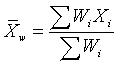
Weighted
Mean:
The weighted mean is a mean where there is some variation in the
relative contribution of individual data values to the mean. Each data
value (Xi) has a weight assigned to it (Wi). Data values with larger
weights contribute more to the weighted mean and data values with
smaller weights contribute less to the weighted mean. The formula is
There are several reasons why you might want to use a weighted
mean.
- Each individual data value might actually
represent a value that is used by multiple people in your sample. The
weight, then, is the number of people associated with that particular
value.
- Your sample might deliberately over
represent or under represent certain segments of the population. To
restore balance, you would place less weight on the over represented
segments of the population and greater weight on the under represented
segments of the population.
- Some values in your data sample might be
known to be more variable (less precise) than other values. You would
place greater weight on those data values known to have greater
precision
Top
Wilcoxon
rank-sum test:
The Wilcoxon Rank Sum test can be used to test the null
hypothesis that two populations X and Y have the same continuous
distribution. We assume that we have independent random samples x1, x2,
. . ., xm and y1, y2,
. . ., yn, of sizes m and n
respectively, from each population. We then merge the data and rank of
each measurement from lowest to highest. All sequences of ties are
assigned an average rank.
The Wilcoxon test statistic W is the sum of the ranks from
population X. Assuming that the two populations have the same continuous
distribution (and no ties occur), then W has a mean and standard
deviation given by
µ
= m (m + n + 1) / 2
and
s =
√[ m n (N + 1) / 12 ],
where N = m + n.
We test the null hypothesis Ho:
No difference in distributions. A one-sided alternative is Ha: first population yields lower
measurements. We use this alternative if we expect or see that W is
unusually lower than its expected value µ . In this case, the p-value
is given by a normal approximation. We let N ~ N( µ , s ) and compute
the left-tail P(N <=W) (using continuity correction if W is an
integer).
If we expect or see that W is much higher than its expected
value, then we should use the alternative Ha: first population yields higher
measurements. In this case, the p-value is given by the right-tail P(N
>= W), again using continuity correction if needed. If the two sums
of ranks from each population are close, then we could use a two-sided
alternative Ha: there is a
difference in distributions. In this case, the p-value is given by twice
the smallest tail value (2*P(N <=W) if W < µ , or 2*P(N >=W)
if W > µ ).
We note that if there are ties, then the validity of this test is
questionable.
Top
XY
Plot:
XY plots(Scatter plots) are similar to line graphs in that they
use horizontal and vertical axes to plot data points. However, they have
a very specific purpose. Scatter plots show how much one variable is
affected by another. The relationship between two variables is called
their correlation .
Scatter plots usually consist of a large body of data. The closer
the data points come when plotted to making a straight line, the higher
the correlation between the two variables, or the stronger the
relationship.
If the data points make a straight line going from the origin out
to high x- and y-values, then the variables are said to have a positive
correlation . If the line goes from a high-value on the y-axis down to
a high-value on the x-axis, the variables have a negative
correlation .
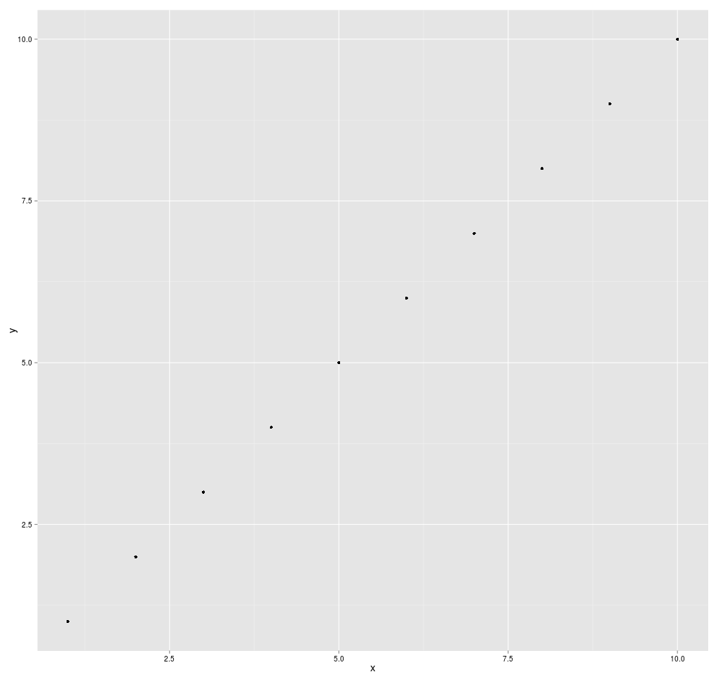
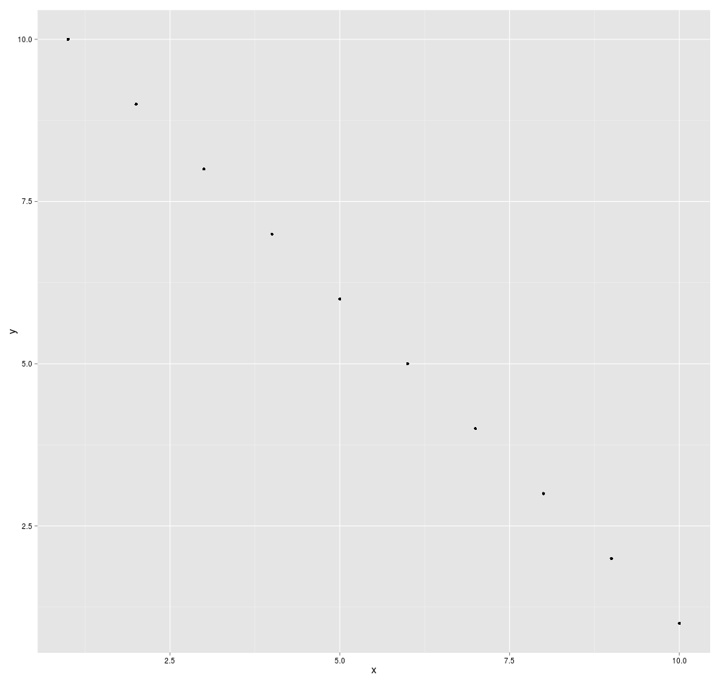
A perfect positive correlation is given the value of 1. A perfect
negative correlation is given the value of -1. If there is absolutely no
correlation present the value given is 0. The closer the number is to 1
or -1, the stronger the correlation, or the stronger the relationship
between the variables. The closer the number is to 0, the weaker the
correlation. So something that seems to kind of correlate in a positive
direction might have a value of 0.67, whereas something with an
extremely weak negative correlation might have the value -.21.
Top