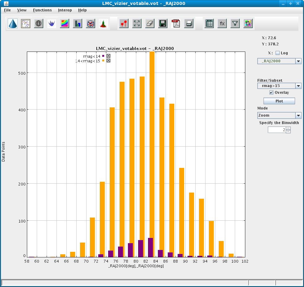
To overlay 2D histograms (simultaneously viewing multiple overlaid histograms with similar range in the same plot)
- Select column to be plotted on the X-axis.
- Click on the Plot button.
- Select column to be plotted on X-axis for the overlay.
- Select the Overlay option.
- Click on the Plot button.
A different color will be used for each histogram, to allow one to differentiate between the histograms. A default legend showing the meaning of each overlay is shown on top-left side of the plot. This can be modified from inside the Plot Properties --> Advanced tab.
Example of overlaid 2D histogram is shown in the Figure below: