VOMegaPlot - The VOTable
plotting utility (Version 1.1)
|
|
|
|


Introduction
VOMegaPlot, a Java based tool, has been developed for plotting different astronomical graphs using data stored in VOTable format.
About VOMegaPlot
VOMegaPlot has been developed as
a part of the Virtual Observatory -
India initiative by Persistent
Systems and the Inter-University Centre for Astronomy and Astrophysics (IUCAA), in collaboration with Centre de
Données astronomiques de
Third Party Tools
- Ptplot 5.2, a 2D data plotter and histogram tool
implemented in Java. Ptplot has been developed at EECS department at the
- VOPlot makes use of cds.astro
(Astronomical coordinate manipulation) package for projection maps. The
package has been developed by CDS,
Getting Started
VOMegaPlot has been optimized for plotting large number of points (of the order of millions). It has been successfully tested for tycho-1 and tycho-2 catalogs.
VOTable xml file needs to be parsed before it is loaded with VOMegaPlot. Use the following command to perform this operation,
java -jar
VOMegaPlot.jar -parse <path of xml> [-targetdir <path to the output
directory>]
The parsing operation creates a set of intermediate files in
the directory specified by targetdir.
The intermediate files will be created in the working directory in case if targetdir is not specified. The parsing
operation creates two files with extension as ‘cfo’ for each numerical column.
It also creates a file with extension as ‘voi’ which should be subsequently
used for loading with VOMegaPlot. All these files will have their names
beginning with the name of the xml file. These files should be placed together
and the file with ‘voi’ as extension should be used for loading instead of the
VOTable xml file.
Please note that, the parsing operation need to be performed only once for a given VOTable xml file. User can reuse the set of intermediate files, created as result of the parsing, any number of times for plotting. Also note that parsing time depends on the number of columns and number of rows that are present in the VOTable file. For a catalog which has about 50 columns and 1,000,000 rows per column, it takes about 20 minutes on a machine having Pentium 4 (2.66 GHz) processor and 512M memory on the Windows platform.
For launching VOMegaPlot you can use,
java -jar
VOMegaPlot.jar
and then the VOTable can be loaded by choosing the corresponding voi file with the help of 'File->Open VOTable' menu.
Alternatively, VOTable can also be loaded with VOMegaPlot with the following command,
java -jar VOMegaPlot.jar -plot <path of voi>
Note: To run VOMegaPlot, you must have JRE 1.4.2 or higher installed. To see the version of JRE installed, type the following command at the command prompt:
java -version
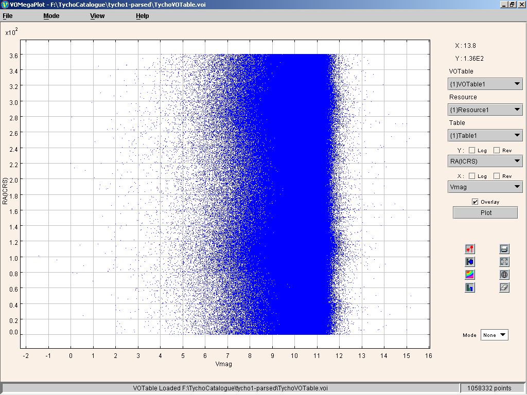
Figure 0
Plotting Scatter Plots
To draw a plot of one columns against the other,
- Select the column to be plotted on the X-axis.
- Select the column to be plotted on the Y-axis.
- Click "Plot" button.
You can see the scatter plot. If required, you can plot data points on a log scale by setting the option appropriately using the "Log" checkbox. Also, by checking the "Rev" checkbox, the data points are plotted on a reverse scale.
Figure 1
Clear Plot
To clear all the selection on the plot, click on the
"Clear plot" icon represented by ![]() .
.
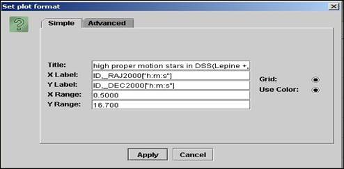
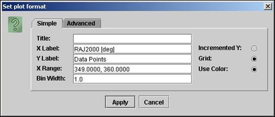
Changing Plot properties
To change the plot properties
click on the properties icon ![]() in the panel to the right of the plot. This
opens the "Set Plot format" dialog as shown in Figure 2.
in the panel to the right of the plot. This
opens the "Set Plot format" dialog as shown in Figure 2.
For changing properties such as title, labels ranges etc., click on the "simple" tab.
Figure 2
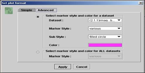
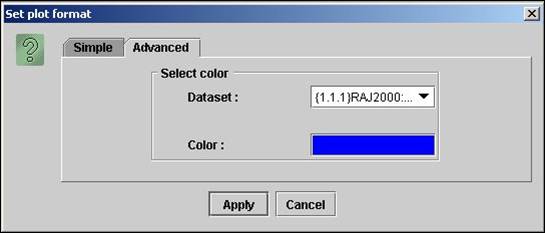
For changing properties like color and marker style click on the "Advanced" tab.
For changing marker style for all datasets click “Select marker style and color for ALL datasets”.
For changing marker style or color of single dataset click “Select marker style and color for a dataset”.
You can choose various marker styles such as "pixels", "points" etc. Setting the marker style to "various" allows plotting with different symbols like triangle, rectangle etc.
Figure 3
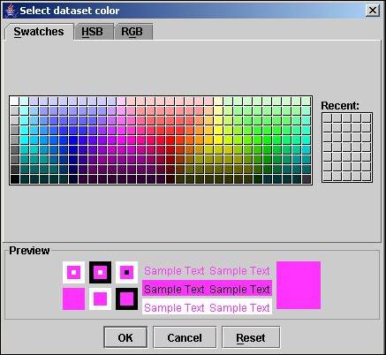
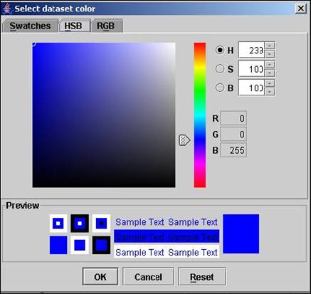
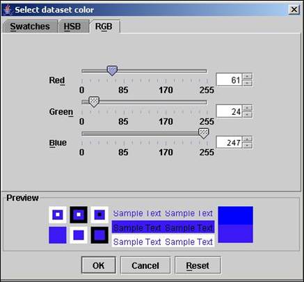
The default color chooser provides three chooser panels:
- Swatches — for choosing a color from a collection of swatches.
Figure 4
- HSB — for choosing a color using the Hue-Saturation-Brightness color model.
Figure 5
- RGB — for choosing a color using the Red-Green-Blue color model.
Figure 6
Loading Multiple VOTables
To Load mutiple VOTables click on the "File -> Open VOTable" menu. The new VOTable is plotted now.
Zooming
For zooming into the plot you need to be in the Zoom mode. To go in zoom mode, choose "Zoom" from "Mode" combo box at the bottom of the panel to the right of the plot.
To zoom in, drag the left mouse button down and to
the right to draw a box around an area that you want to see in detail. To zoom
out, drag the left mouse button up and to the left. To get the
original graph click on the "Reset" icon represented by ![]() .
.
Overlaying Plots
To overlay plots (simultaneously viewing multiple plots with similar range on the same axes system)
- Select column to be plotted on the X-axis.
- Select column to be plotted on the Y-axis.
- Click "Plot" button.
- Select column to be plotted on X-axis (represents another plot).
- Select column to be plotted on Y-axis (represents another plot)
- Set the "Overlay" option.
- Click "Plot" button.
Note: If you want to overlay x, y columns of
one VOTable on x, y columns of another VOTable select the VOTable from the
VOTable Combo Box on the right of plot. (If there are multiples resources in a
VOTable or multiple tables in a resource, use the Resource and Table combo
boxes in order to select another resource or table before choosing x, y
columns).
With overlaid plots, legends are added on the right hand side. Each one of the VOTable, Resource and Table combo boxes display an index along with the name of the VOTable, Resource or Table. The index is displayed within curly brackets {} in each of the combo boxes. The indexes are combined together along with the column name to form a legend.
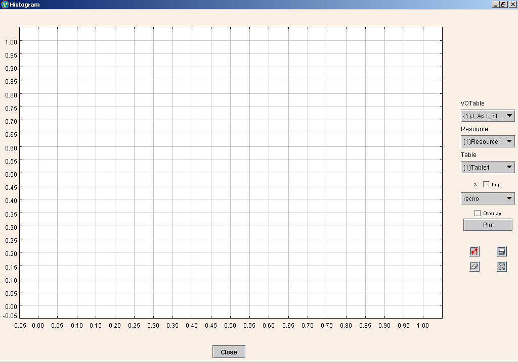
Histogram Plot
To launch histogram window click on “View -> Histogram
Plot” menu or the “Histogram” button ![]() .
.
Figure 7
To draw the histogram of a column
- Click "Histogram" button
 .
.
- On the popped up histogram, select the column for which histogram is to be plotted and click on the Plot button.
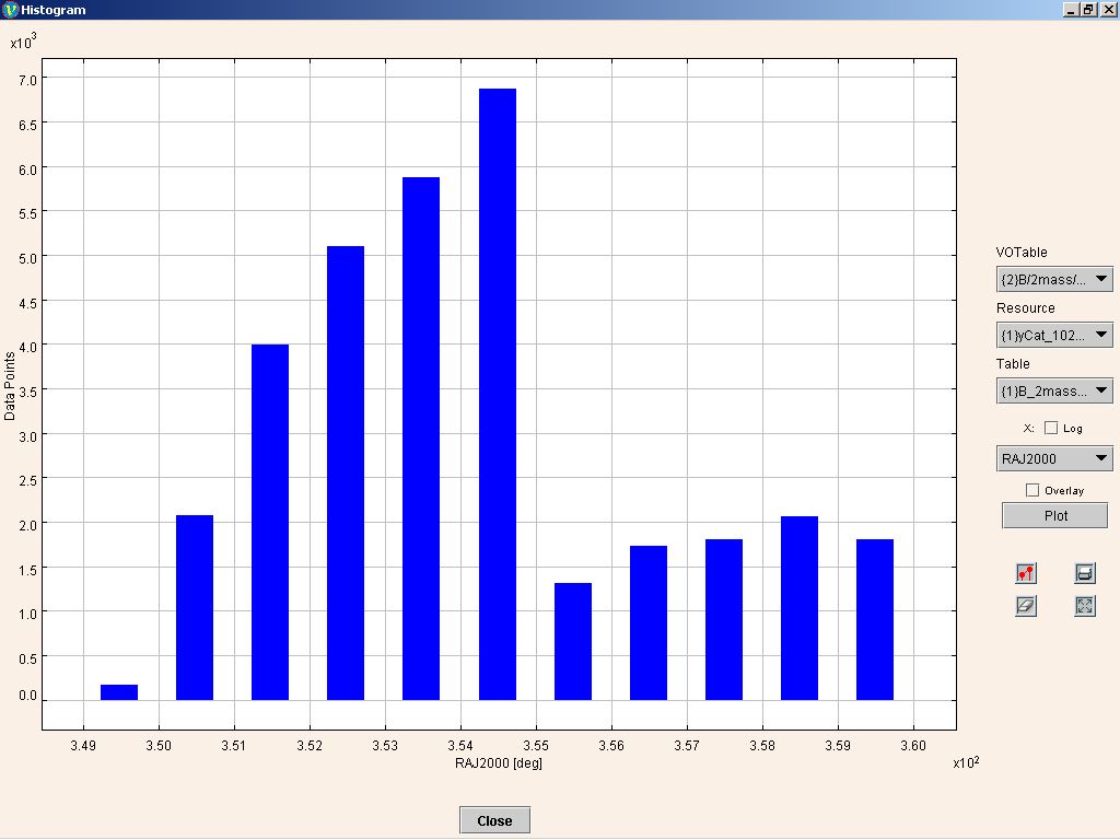
A sample histogram is shown in Figure 8.
Figure 8
If you want to plot the histogram of data points on a log scale, then check the "Log" checkbox corresponding to the X-axis.
Changing Histogram properties
To change the histogram
properties click on the ![]() button.
button.
Click on the "Simple" tab to change properties like the bin width, X Label, Y Label, X range, etc.
Figure 9
Click on the "Advanced" tab to change the color of the histogram.
Figure 10
The color panel provides facility to select color using swatches, hue saturation brightness(HSB) color model and red green blue(RGB) color model
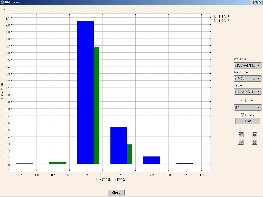
Overlaying Histograms
To overlay histograms (simultaneously viewing multiple histograms with similar range)
- Select column to be plotted on the X-axis.
- Click "Plot" button.
- Select column to be plotter on X-axis (represents another plot)
- Set the "Overlay" option.
- Click "Plot" button.
Example of overlaid histogram is shown in Figure 11.
Figure 11
Density Plot
The density plot is made up of a grid which comprises of 10000 (100 X 100) cells. Two parameters namely, cell density and total count are displayed to help understand the distribution of data points. Both these parameters are associated with a specific color shade. Cell density indicates number of points (range) that lie within one cell. Whereas the total count indicates total number of points that have been assigned a specific color shade.
A sample density plot is shown below.
To view the density plot
corresponding to the scatter plot, click on the density plot icon ![]() in the panel to the right of the plot.
in the panel to the right of the plot.
Figure 12

Projection Plot
The stars on the celestial sphere are like cities on the globe. While a globe is the most accurate representation of geography, it is difficult to carry around. We have invented flat representations of the globe that, although they distort shapes, areas, and directions are a whole lot easier to carry around. Projections are mappings from this 3D space to a 2D space.
RA, DEC columns are needed for projection plot. You can use the following command to check whether the RA, DEC columns have been correctly identified and if not set them.
java -jar VOMegaPlot.jar -setRADEC < path of voi file for which you
need to set RA, DEC columns >
In case, you do not set the RA and DEC columns through command line and VOMegaPlot even does not find the RA and DEC columns, you will be prompted with a dialog to select the RA and DEC columns when the projection plot window opens.
The projection plot for the data
plotted in VOMegaPlot can be seen by clicking on projection plot icon ![]() on the panel to the right of the plot.
on the panel to the right of the plot.
For every VOTable loaded in VOMegaPlot there will be a corresponding dataset in the projection plot. Selecting/Unselecting points in the projection plot will also select corresponding points in the main plot and vice versa.
The following 3 types of projections are provided:
- Sinusoidal/Sanson Projection
- Aitoff/Hammer Projection
- Mollweide Projection
Changing the type of Projection:
The projection type change can be changed by selecting the projection type from the "Projection type" combo box from the projection plot dialog.
Changing the Center
of Projection
The center of projection is the coordinates of the center point of the projected sphere. We can see the projected points from different positions such as "Standard", "North Pole" and "South Pole" by changing the center of projection.
The center of projection can be changed by selecting the center type from the "Center" combo box.
Sinusoidal Projection Plot for ‘Tycho-1’ catalog is shown in Figure 13:
Figure 13

Feedback Address
We would be happy to receive any feedback/comments on VOMegaPlot. For feedback and comments please contact voindia@vo.iucaa.ernet.in.